Graphic Details
(1983-1999)During this period I worked as a graphic designer at Pentagram (for partner Alan Fletcher), Fitch, Rod Dyer Group (in LA) and Lambie-Nairn, before setting up my own practice.
The principle areas of my design work at these companies were print, retail, film and TV respectively; much of which I carried on into my own practice. Notable clients included Lloyd’s of London, Mandarin Oriental Hotels, Mercedes Benz, United Artists & Simpson Paper (US) and the BBC.
The work varied dramatically in scope, from a quick greetings card to huge branding and publication projects that took up to two years. But irrespective of the scale, there was occasionally a small design detail of my work on a project that I would extract and hang on to because it resonated with me in some way.
This is a small selection of these so-called graphic details from that period, with each caption ending with where I was at the time: P - Pentagram, RDG - Rod Dyer Group, LN - Lambie-Nairn and PH - my own practice.
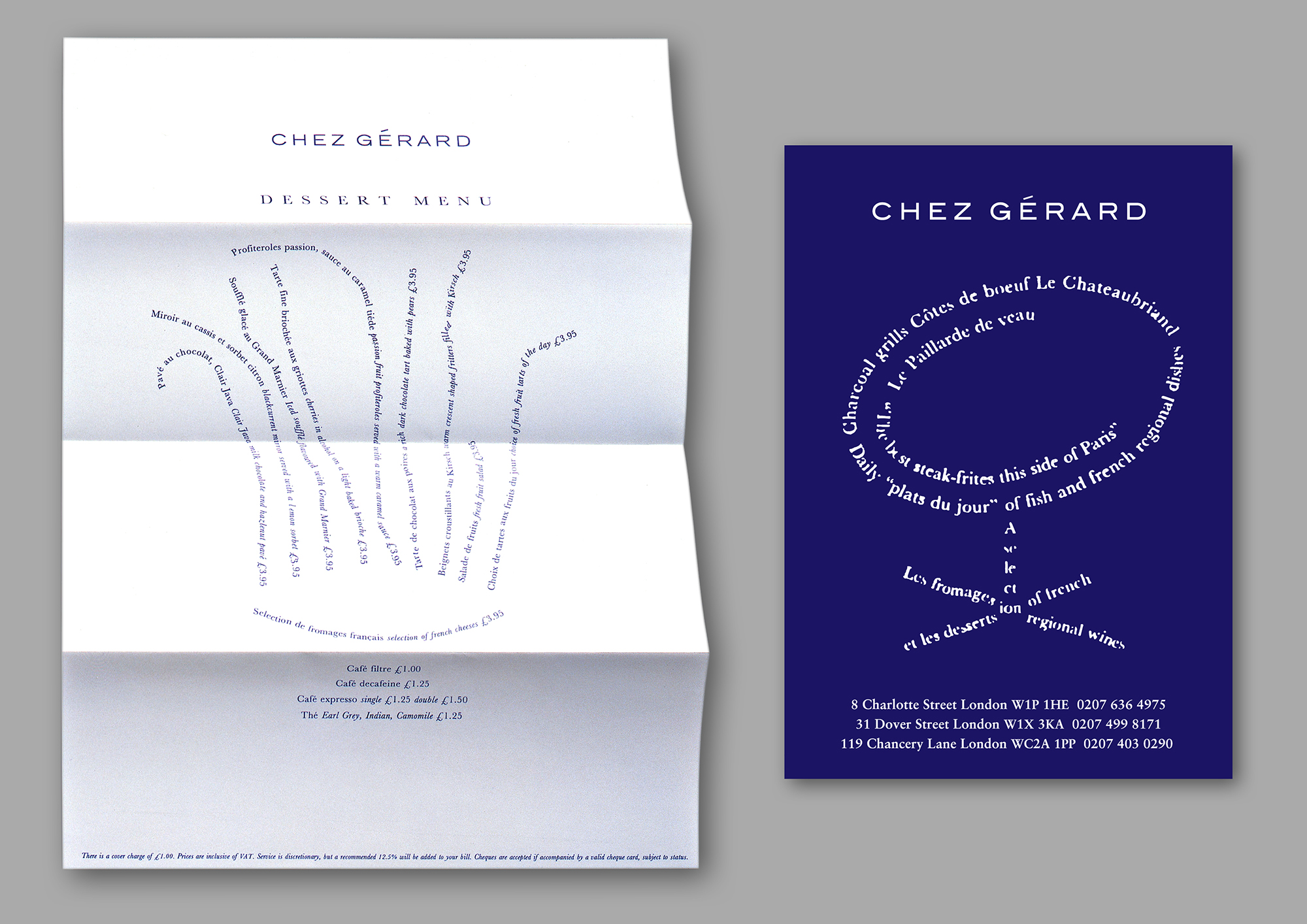
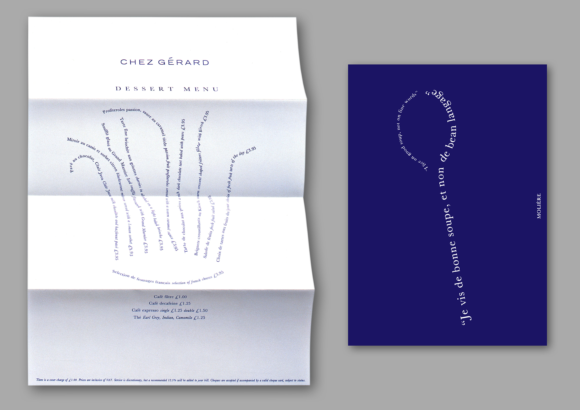
These were part of my rebrand for London french restaurant group Chez Gerard, with typographic imagery inspired by Apollinaire’s Calligrammes1 printed on these keepsake cards and oversized newsprint-like paper for the menus. PH.

Further letterforms as imagery/ideas, as well as imagery itself creating letterforms. The letters that make up the words Up To Date were used to create a type face for the cover of a typography magazine, P; and the Exploration logo became an imagined scientific equation for the branding of a new Simpson paper range, RDG.
Meanwhile, the logo for marketing consultancy Generator turned alphabet photography on its head, with a letter G specially made out of machine parts to simulate a moving engine, LN.
Meanwhile, the logo for marketing consultancy Generator turned alphabet photography on its head, with a letter G specially made out of machine parts to simulate a moving engine, LN.

These two images were motifs from larger projects, in physical size and scope respectively. Their apparent simplicity belied the heavy-lifting they were doing.
The geometric pattern in Chandelier was the central graphic on an oversized printed poster for lighting designer SKK’s exhibition, showcasing modern chandelier design. An abstract graphic reponse to a rapid brief with minimal budget and no access to images of the exhibits, PH.
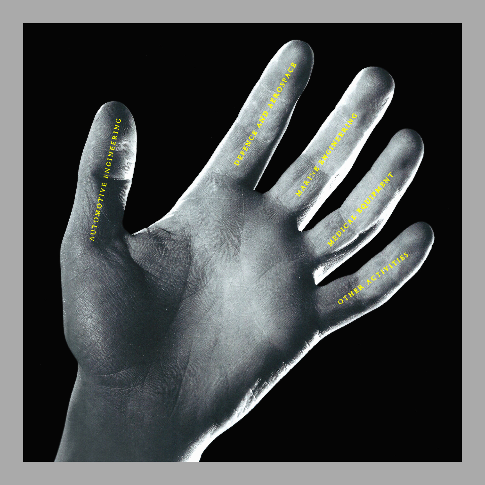
The hand graced the cover of the Vickers Annual Report, and set up the visual theme of detailed black & white photographs of hands doing engineering things throughout the publication. But in its own right the image provided a playful diagram of the company and its five divisions, as well as a metaphor for the company’s renowned craftsmanship and precision engineering, LN.
The geometric pattern in Chandelier was the central graphic on an oversized printed poster for lighting designer SKK’s exhibition, showcasing modern chandelier design. An abstract graphic reponse to a rapid brief with minimal budget and no access to images of the exhibits, PH.
The hand graced the cover of the Vickers Annual Report, and set up the visual theme of detailed black & white photographs of hands doing engineering things throughout the publication. But in its own right the image provided a playful diagram of the company and its five divisions, as well as a metaphor for the company’s renowned craftsmanship and precision engineering, LN.


These printed books have endured in my collection largely because, despite being simply saddle-stitched, they have a tactile quality that makes you want to pick them up and handle them.
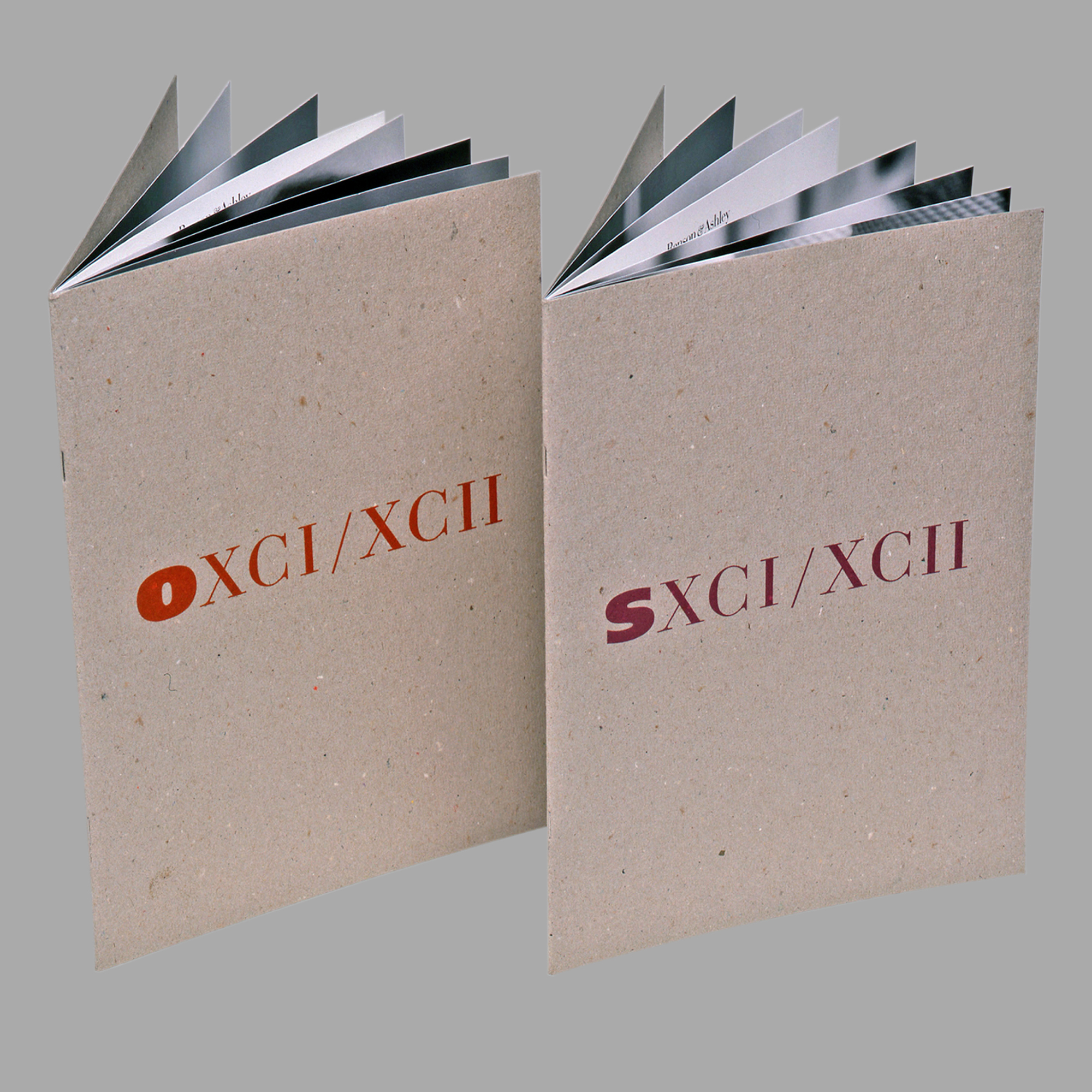
The leather-bound cover of Theo Crosby’s essay Architecture & Poetry was debossed with an enigmatic ampersand, while the inside pages were printed on a mix of coloured papers, P. The Lambie-Nairn+Company publication combined a richly coloured embossed paper dust jacket and cover with a riot of full bleed imagery on the pages inside, LN. So too with OXCII & SXCII for eyewear company Benson & Ashley, but in this case raw cardboard covers and full bleed black & white fashion photography inside, PH.
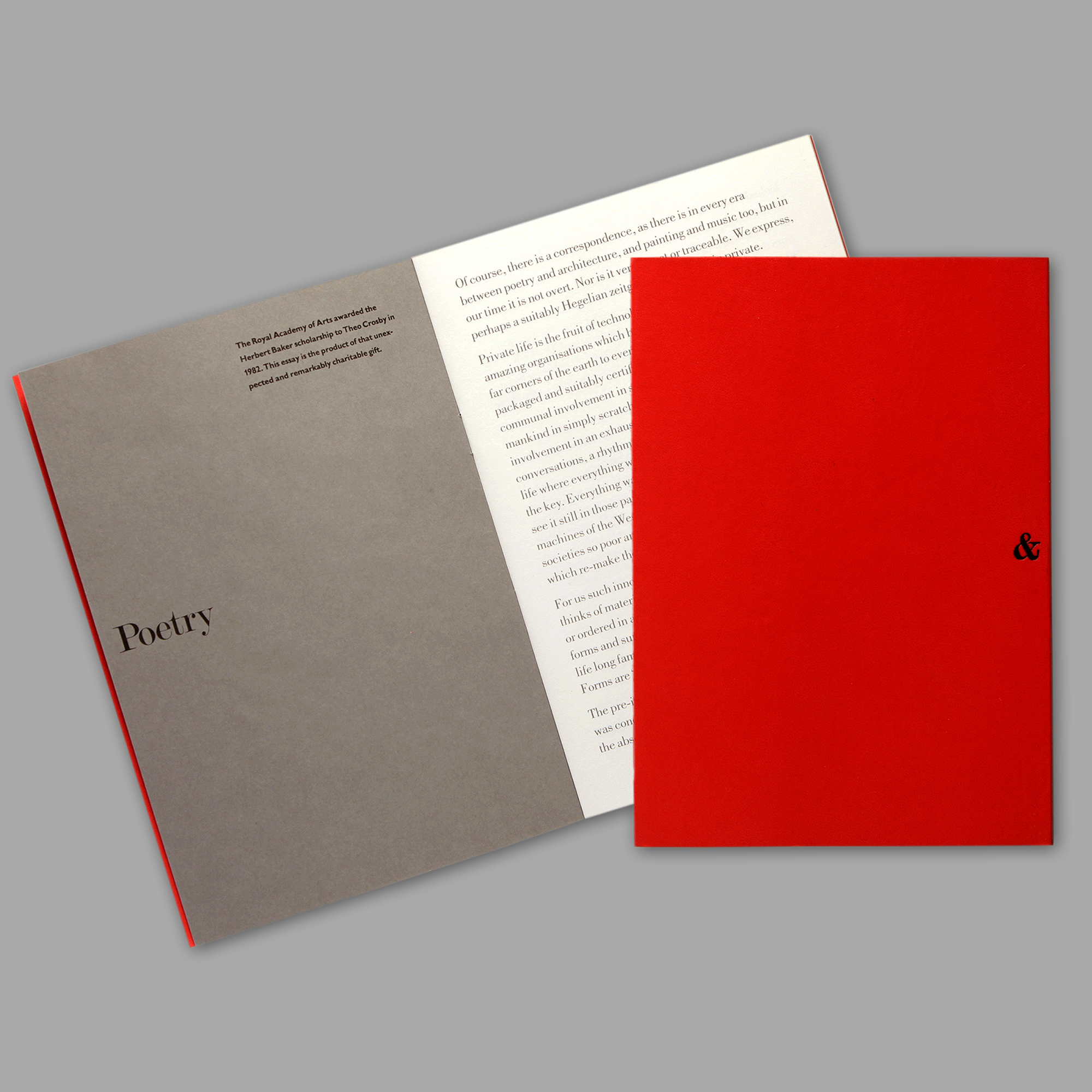
The leather-bound cover of Theo Crosby’s essay Architecture & Poetry was debossed with an enigmatic ampersand, while the inside pages were printed on a mix of coloured papers, P. The Lambie-Nairn+Company publication combined a richly coloured embossed paper dust jacket and cover with a riot of full bleed imagery on the pages inside, LN. So too with OXCII & SXCII for eyewear company Benson & Ashley, but in this case raw cardboard covers and full bleed black & white fashion photography inside, PH.
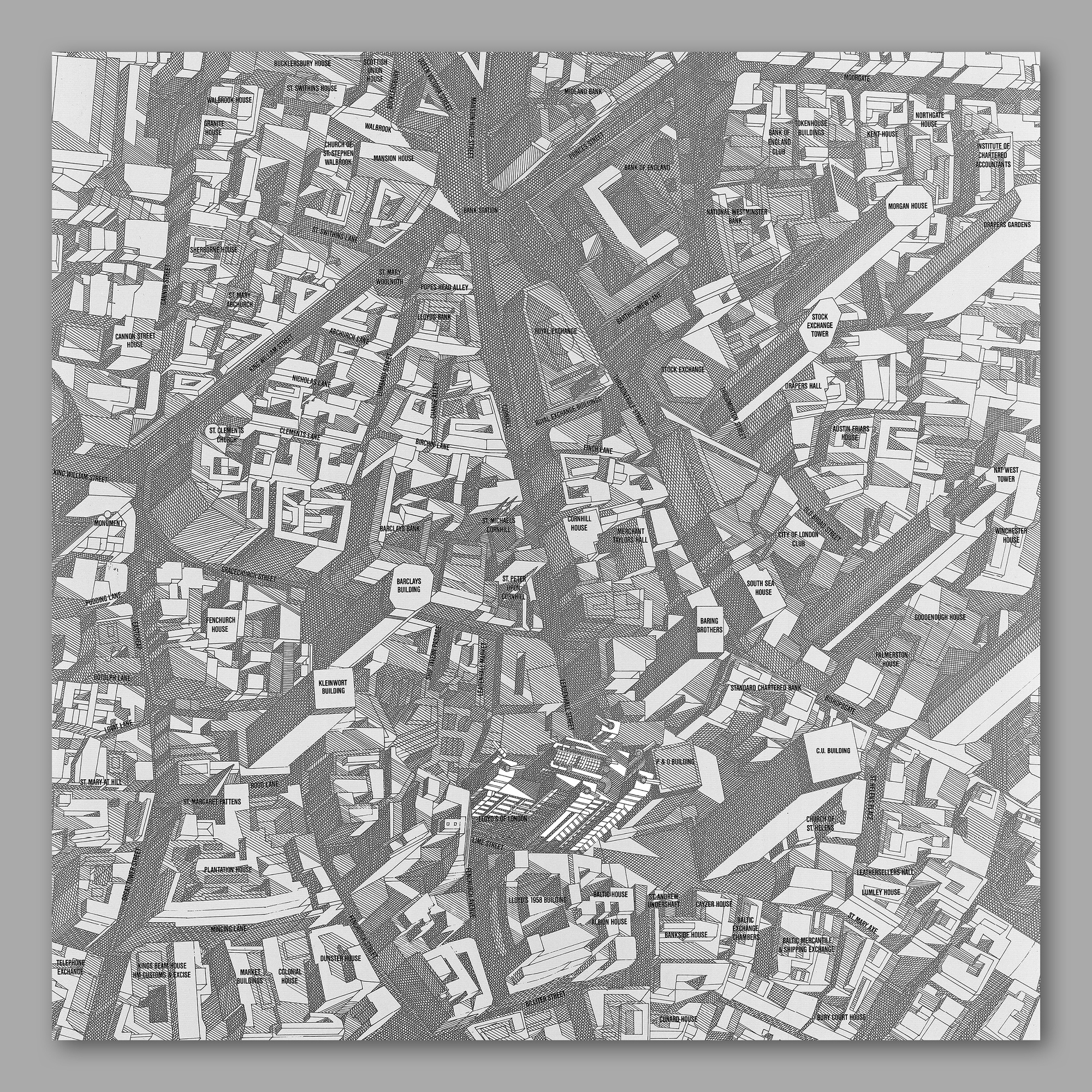
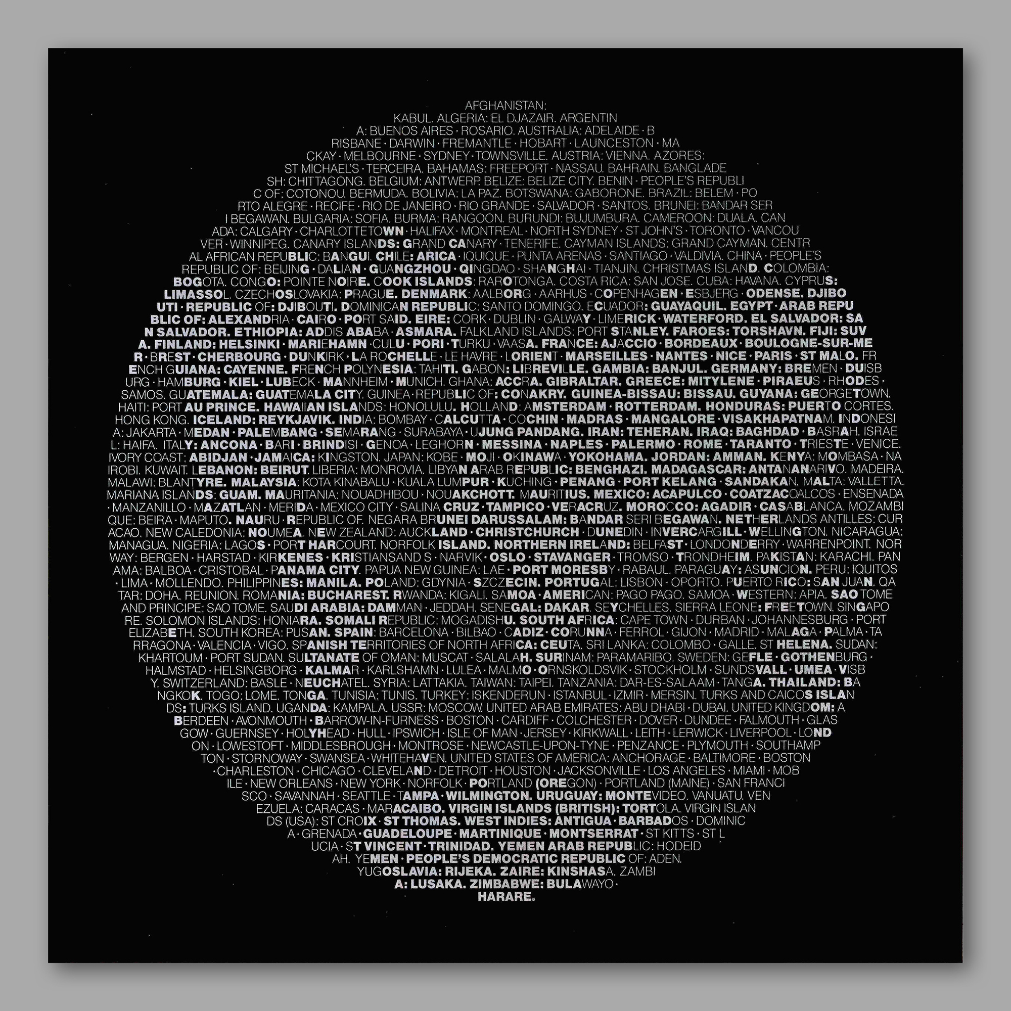
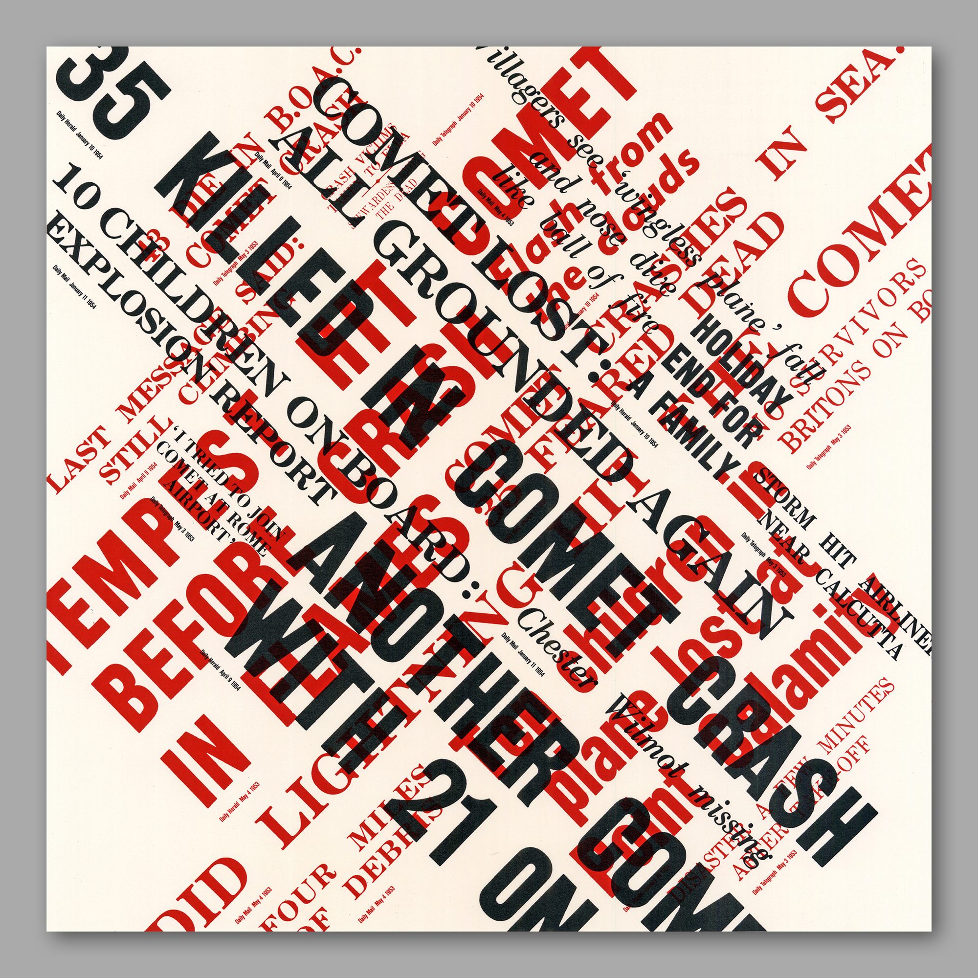

Building Lloyd’s was a boxed exhibition of photos and graphics - including a scaled-down paper model - commemorating the insurer’s new building, designed by Richard Rogers. The project’s vast content was condensed down to the more managable publication with silver embossed grey cover shown here.
Of the 100 or so images in the boxed exhibition I had a particular attachment to these three images, in part for the work and resourcefulness they required to come into being in the pre-internet/digital era. ‘The Building in Context’ was inspired by the Anderson Map of Midtown Manhattan, and my art direction2 included personal aerial photography supervision (in a twin-engine over the city); ’Lloyd’s World’ featured a typographic global list/map of its agents’ locations; and ‘The Comet Disasters’ used 1950s headlines sourced from microfiche at the British Newspaper Archive.
Of the 100 or so images in the boxed exhibition I had a particular attachment to these three images, in part for the work and resourcefulness they required to come into being in the pre-internet/digital era. ‘The Building in Context’ was inspired by the Anderson Map of Midtown Manhattan, and my art direction2 included personal aerial photography supervision (in a twin-engine over the city); ’Lloyd’s World’ featured a typographic global list/map of its agents’ locations; and ‘The Comet Disasters’ used 1950s headlines sourced from microfiche at the British Newspaper Archive.
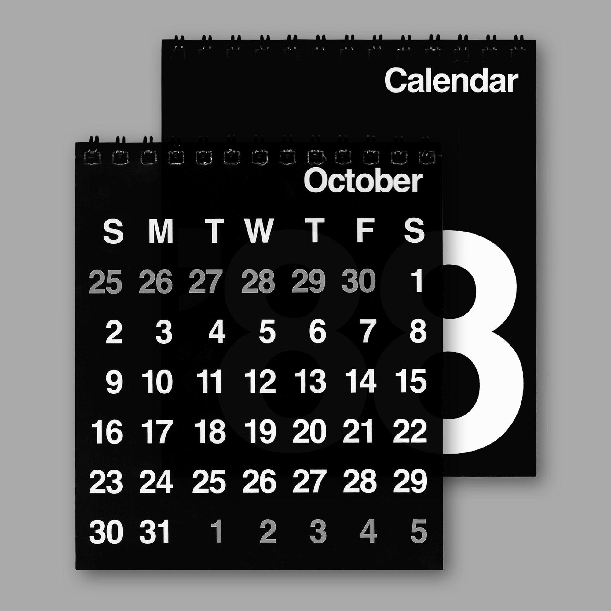
Unadorned typographic design on these utility desk calendars for a Japanese stationery retailer OUN, P.
1 G, Apollinaire. (1918) Calligrammes: Poems of Peace and War 1913-1916.
2 ‘The Building in Context’ was illustrated by Ron Sandford (1985).
2 ‘The Building in Context’ was illustrated by Ron Sandford (1985).